Wisetail Design System
A flexible and brand-neutral design system for the administrative tools of a B2B2C platform.
Roles: creative director, team lead
Year: initial release 2019
Context
After rapid growth of both the product design and engineering teams, it became evident that we needed more tools to improve our consistency and efficiency. As Lead Product Designer, I advocated for the creation of a design system in partnership with software engineering. I provided guidance and feedback throughout the project while the product designers on the team took ownership of the shape of the design system and the guiding principles.
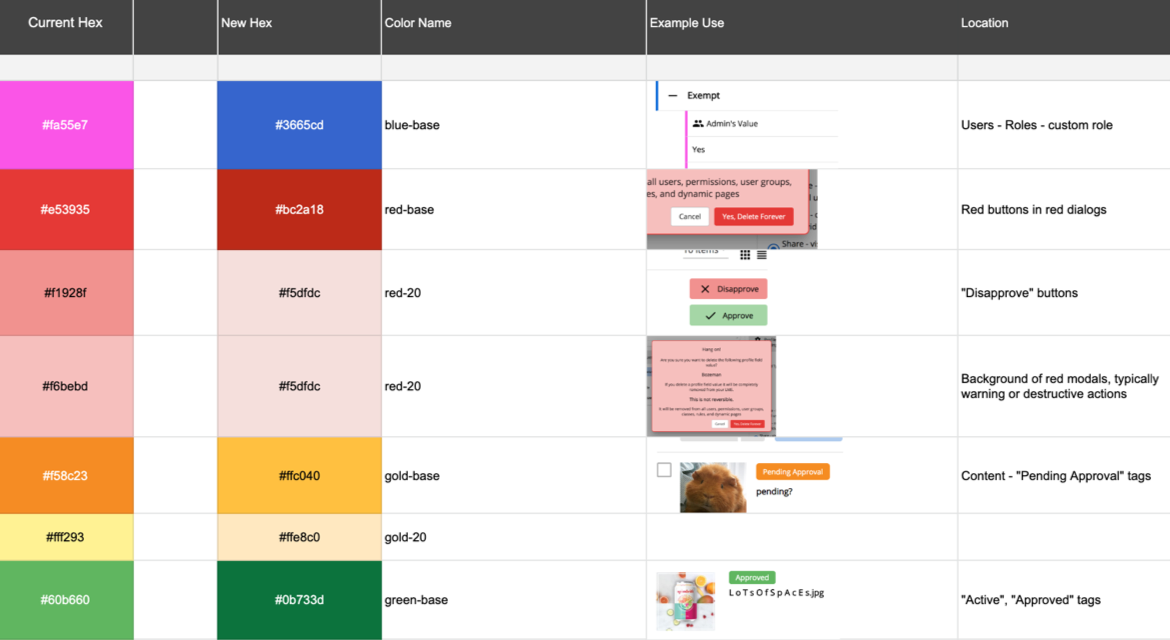
Part of the color audit spreadsheet with new design system colors - check out that hot, hot pink!
Process
We began with a thorough audit of the existing UI in order to catalog inconsistencies, repeat components, and opportunities for improvement. Two years after the last major UI update, we unearthed some surprising finds, including 11 different greys, 20 different colors and 5 search bar configurations.
It was important to me that the design system was a truly collaborative project, equally owned by all the designers. To support this, the team crafted shared principles to guide decision-making as we moved forward into the creation phase.
We made the decision to follow the Atomic Design methodology to define the system, as described by Brad Frost. Starting with "elements" such as the type ramp and grid, the system builds to complex "molecules" like alert prompts and forms. I challenged the team to think into the future, creating an accessible color palette and making typography decisions that would allow the support of additional languages/character sets.
The process was deeply collaborative, drawing on the strengths of the full team. Designers would work on previously-agreed-upon components for a period of hours or days, then reconvene as a group to review and critique. After a component was finalized, it had to be documented in zeroheight - a general description of the component and its states, design specs, and proper usage. We tracked the progress of the component design, resulting in coverage of 95% of the product's administrative tool UI.
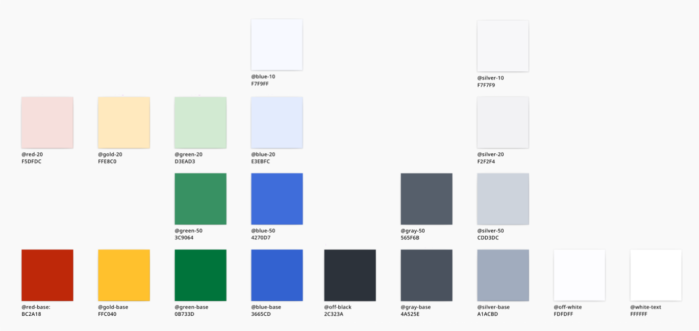
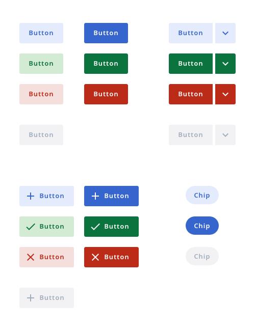
The new color palette and a selection of updated buttons from the design system.
Design team: Shane Johnson, Pierce Wolcott, and Paige Rittersbacher
Outcome
I'm incredibly proud of both the collaborative process and the current system that the team created. As the team lead, it was a pleasure for me to create space and opportunity for the product designers to craft a usable design system. Every piece of the UI was considered, from grid guidelines to form layouts to the voice and tone of the microcopy. The design system is actively in use today and continues to serve as a valuable tool in maintaining design consistency between projects, products, and product designers.
The full design system documentation can be viewed here.